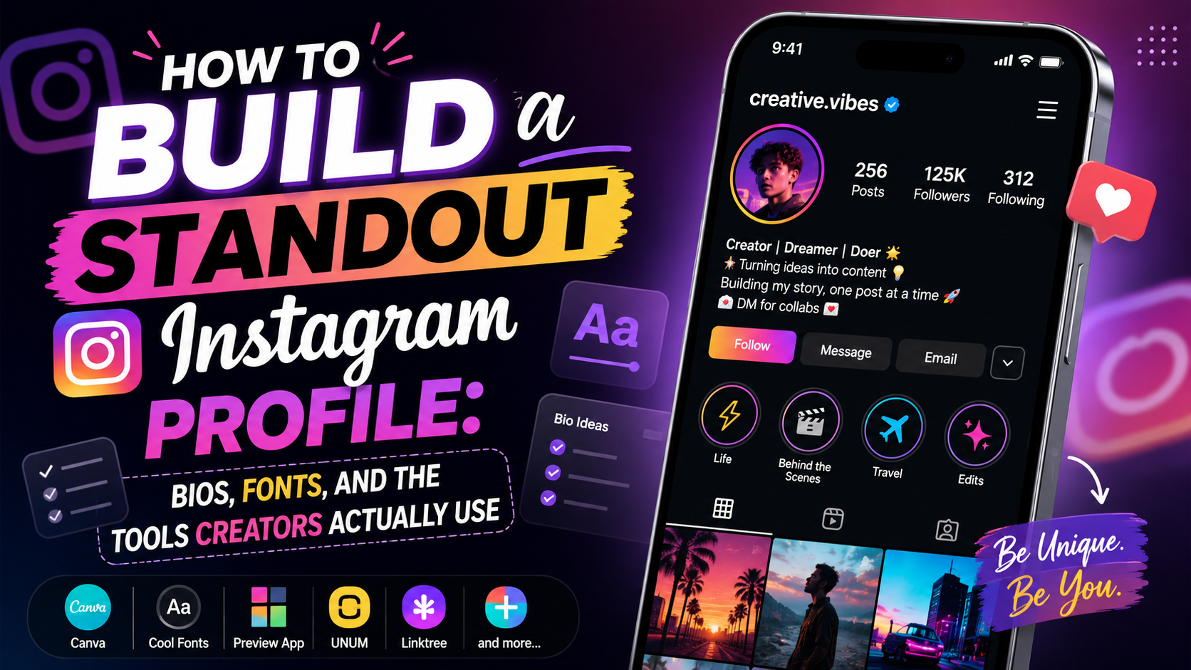
Your Instagram profile is the first impression most people get before they ever see your content. In the first few seconds, a visitor decides whether to hit follow or scroll past, and that decision is shaped almost entirely by a handful of small things: your profile picture, your bio, how put-together the whole page feels, and whether the account looks active or abandoned. Getting those right doesn’t take a full redesign or a marketing budget. It takes a handful of small, deliberate choices, repeated consistently.
This guide walks through the pieces that actually move the needle, bio writing, styling, profile picture and highlights, grid consistency, and the tools creators use to manage all of it once a single account turns into several.
Start With a Bio That Actually Says Something
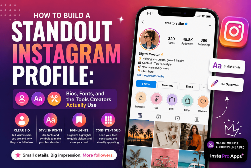
A good bio isn’t clever for the sake of being clever, it answers three silent questions a visitor has: who are you, what do you post, and why should I care. Skip generic lines like “living my best life” or “just here for good vibes” and instead be specific: your niche, your personality, and a reason to stick around. That reason could be a posting schedule, a value you bring (tips, humor, behind-the-scenes access), or a running joke that makes your account feel like a place rather than a feed.
Structure your bio in short lines rather than one dense paragraph. Whitespace makes a bio easier to scan, and scannability is most of what makes a profile feel professional. A common mistake is trying to cram every credential, hashtag, and call-to-action into 150 characters, the result usually reads as noise rather than information. Pick the two or three things that matter most and let the rest go.
It also helps to think of your bio as a living piece of content rather than something you set once and forget. As your account grows or your focus shifts, revisit it. A bio that made sense when you had 200 followers and a loosely defined niche often reads as outdated once you’ve found your actual audience.
Fonts and Styling: Small Details, Big Impact
Once the words are right, styling gives your bio visual personality. Stylized fonts, symbols, and spacing tricks can make a name or bio line stand out in a feed full of default text, as long as they’re used sparingly. One styled element (your name, or a single bio line) reads as intentional. Five different fonts crammed into one bio reads as clutter, and can actually make the text harder to read on smaller screens.
If you want to experiment without manually hunting for Unicode characters, a bio style generator is the easiest way to preview different font and symbol combinations before committing to one. It’s worth spending ten minutes trying a few options side by side rather than settling on the first thing that looks passable, small differences in spacing or symbol choice can change how “designed” a bio feels.
A practical tip: test your bio on both light and dark mode before publishing. Some symbols and fonts render inconsistently across devices and operating systems, and a bio that looks sharp on your phone might display oddly for a visitor on a different setup.
Profile Picture and Highlights: The Frame Around Everything Else
Your bio and grid get most of the attention in profile-building advice, but the profile picture and story highlights do a lot of quiet work too. A clear, well-lit, recognizable photo (or a simple, high-contrast logo for brand accounts) performs better than something busy or low-resolution, remember it’s displayed at a tiny size in feeds, comments, and search results, so detail gets lost fast.
Highlights, meanwhile, act as a secondary navigation menu for your profile. Instead of leaving them as an unlabeled scroll of old stories, group them by topic, an FAQ, a “start here” for new visitors, behind-the-scenes content, or product/service categories if you’re running a business account. Custom highlight covers that match your overall aesthetic tie the whole profile together and reinforce the sense that this is a maintained, intentional space rather than an account that gets occasional attention.
Consistency Across Your Grid
Fonts and bios get attention because they’re easy to change, but consistency in your grid, color tones, layout rhythm, recurring visual elements, is what actually makes an account look established. You don’t need a strict color palette or professional editing software. Even something as simple as consistent lighting, a repeated frame style, or sticking to two or three filters creates enough visual pattern that your grid reads as curated rather than random.
This doesn’t mean every post has to look identical. Variety keeps a feed interesting. The goal is a recognizable thread running through your content, not uniformity, think of it as a visual signature rather than a template.
Common Mistakes Worth Avoiding
A few patterns show up repeatedly on profiles that struggle to convert visitors into followers:
- Inconsistent posting with no clear focus. A profile that jumps between five unrelated topics makes it hard for a new visitor to know what they’re signing up for.
- A bio with no personality. Overly formal or generic bios blend into the background; a little voice goes a long way.
- Ignoring the first nine posts. Whether it’s fair or not, new visitors judge an account largely by what’s visible without scrolling. Pinning or arranging your strongest recent content matters.
- Neglecting highlights and captions. These are free real estate for context and personality that a lot of accounts leave blank.
None of these are difficult to fix, they just require treating your profile as something worth maintaining, not something you set up once and forget.
Managing Multiple Accounts and Extra Customization
Creators and small businesses often end up juggling more than one Instagram account, a personal page alongside a brand or niche page, or a backup account for testing content ideas before posting them on a main profile. Switching between accounts natively works fine for casual use, but once you’re managing several profiles seriously, dedicated tools built around multi-account use start to make more sense than the default app experience.
This is where third-party Instagram apps come in. Tools like Insta Pro Apps are built specifically for creators who want more control than the standard app offers, easier account switching, more customization around how content is viewed and saved, and features aimed at people managing an active presence rather than a single casual account. It’s not something every user needs, but for anyone treating Instagram as more than a hobby, it’s worth knowing these options exist alongside the official app.
Bio, Profile, and Tools Working Together
None of these elements, bio, fonts, profile picture, highlights, grid consistency, or the apps you manage your account with, do much in isolation. A sharp bio with an inconsistent grid still looks unfinished. A polished grid with a lazy bio still loses potential followers in the first few seconds. A great highlight strategy doesn’t matter if the profile picture is a blurry, unrecognizable thumbnail. Treat your profile as one connected first impression, and be as deliberate about the small details as you are about your actual content.
If you’re actively building out a profile from scratch, it’s worth revisiting your bio and overall setup every so often as your account grows, what worked as a placeholder in your first week rarely reflects the account you have a few months in. Platforms like instaproapps.co.in are also useful to keep an eye on for anyone exploring more advanced Instagram management options as their account scales and their needs get more specific.
Small, consistent updates to how your profile looks and functions add up over time. They’re the easiest high-leverage changes a creator can make, no redesign required, just a willingness to occasionally step back and look at your profile the way a new visitor would.
Read more related blogs on Instagram Bio Style Generator. Also join WhatsApp for more update.